


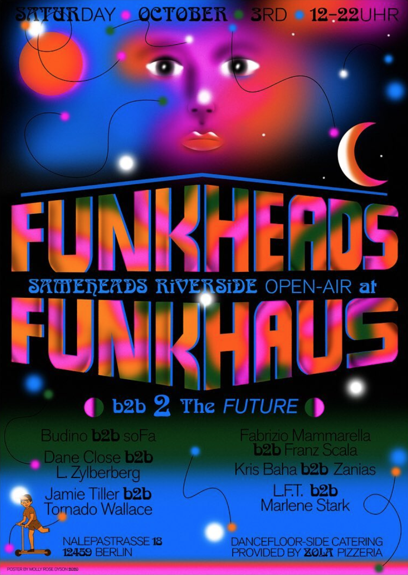
Molly Dyson’s illustration and design work arranges dreamlike visions of the future, informed by hazy recollections of the past. The artist experiments with bold typography, bright palettes and surreal graphics. She reveals “I like to play with depth and overlap and make the eye work to figure out what’s going on.” Her work is often used to market upcoming music events, recognisable to punters in Naarm (Melbourne) and across Europe. What perhaps is most striking about Molly’s body of work is how seamlessly her design voice channels the varied sounds her posters represent. Her retro nostalgia aesthetic is consistent yet she's always in tune with the gig.
Molly grew up in the Western suburbs of Naarm before making the move to Berlin in 2012, taking her first design commission the same year. Since then, she has accepted poster art commissions for Neu, Kaputt in Cologne and Sameheads in Berlin. Speaking about the role music plays in her life, she informs me, “my dad and siblings are musicians so music has always been a big part of my life. I’ve played in a few bands but I much prefer being on the side of making posters and album artwork for friends rather than being on the stage! My first ongoing design job was making posters for friends in Cologne who were putting on shows and I think that helped me develop a style that fit with designing for musicians.”
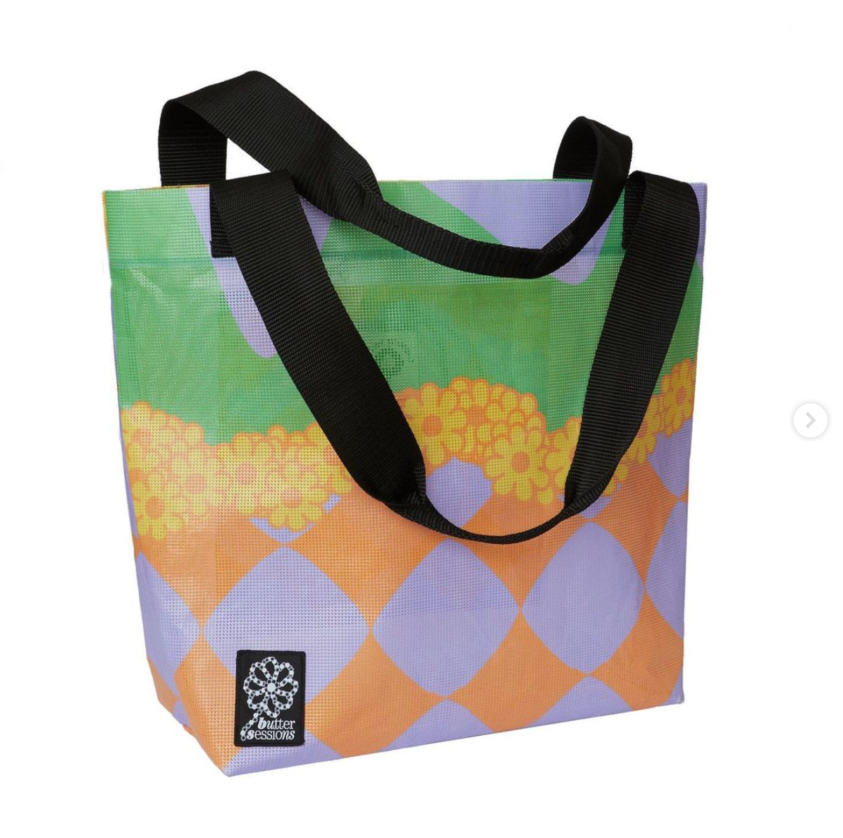
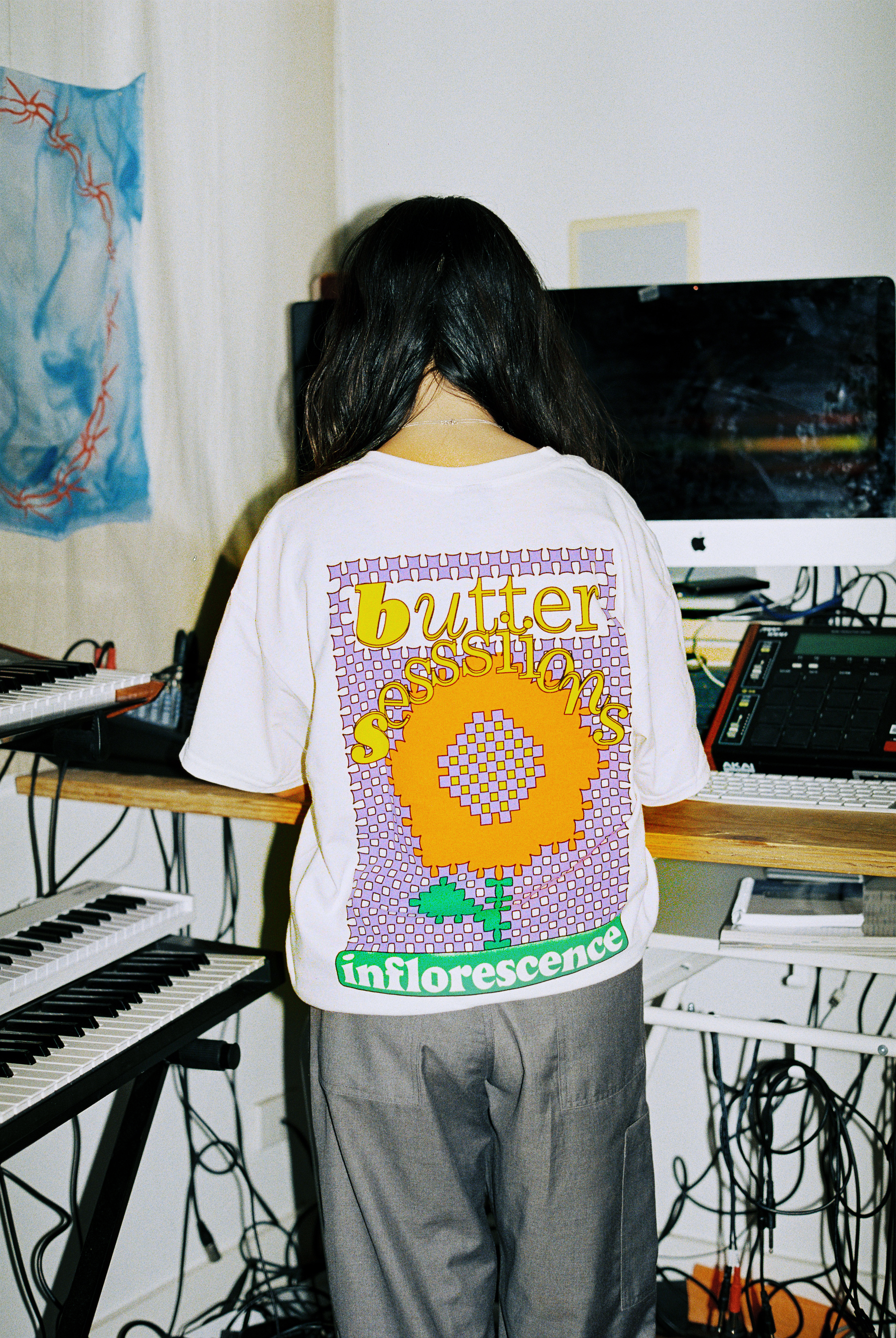
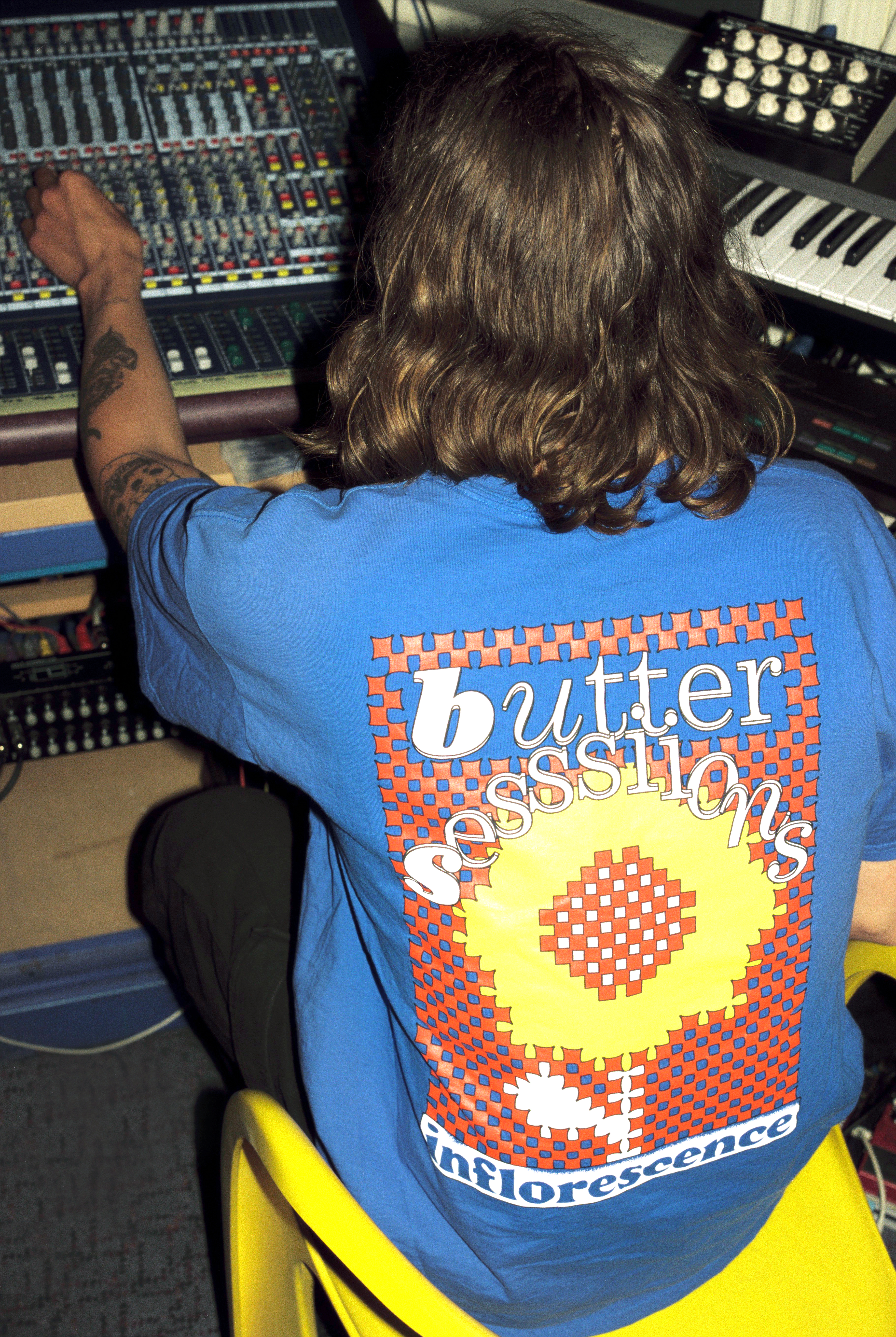
Recently, Molly was asked to produce a line of Butter Sessions merchandise; Inflorescence. She chats to me in between moving apartments in the middle of a Berlin lockdown.
Can you tell me a bit about what led you to become a graphic designer?
I originally studied fine arts at the VCA in Melbourne but I never really felt comfortable as an ‘artist’, the work I made at VCA was critiqued by some professors as being too illustrative, which I thought was a bad thing! (but to be fair what I was making wasn’t very good). After graduating I realised being an illustrator was a possible career and the things i’d always been interested in; children's book illustration, posters, type and packaging design started to make sense. I moved to Berlin and attempted being a freelance illustrator but I didn’t really know how to use Adobe programs or anything like that. I worked a lot of odd jobs, taught myself Photoshop and Illustrator, learnt German and ended up studying Visual Communication at Weißensee Kunsthochschule in Berlin. It’s a small university in the east of Berlin that was one of the main design and art schools of the former GDR. I had intended to study illustration there but coincidentally the first 2 years of my degree the visual communication department had no illustration professor. I did alot of type, editorial and exhibition design projects there particularly with Prof. Wim Westerveld, the typography professor. He really encouraged me to develop my type and poster design skills which was a happy accident because I think combining illustration and type design allowed me to find a niche where I can create work for a range of contexts.
What do you find is currently influencing you visually? Where do you look for inspiration?
I am a bit addicted to instagram and always feel so excited and inspired by what people share on there, particularly seeing what friends are making like James Vinciguerra, Maren Karlson, Lasse Wandschneider, Bea Kittelmann, Ruby Hoppen, Marijn Degenaar, Adrienne Kammerer, Jack Taylor. I also often come back to the work of Mitsuo Katsui, a Japanese graphic designer whose work is really focused on colour and optical illusions.
Your works seem to inhabit quite a distinctive and almost galactic, interstellar world. How did you carve out your own style?
I think it was a combination of how I used certain tools on photoshop and an interest I have in sci-fi movie posters and book covers. I’m sorry to say that I don’t really enjoy reading sci-fi much, the covers of the books always interested me more than the stories. As a kid my dad had a bunch of 70’s Asimov sci-fi books and I used to stare at the covers finding them kind of grotesque and interesting. I still do! I think the way I use photoshop lends itself to a galactic style, lots of glowing, shining shapes, contrasting colours, airbrush textures and mysterious voids.
You are an important designer in music flyers, album covers and merchandise. How do you find music intersects or directs a visual outcome for a commission of this nature?
That is so nice of you to say! I think when it comes to making posters for shows or parties I like to try and make something that might anticipate the vibe of the event somehow, to try and create a bit of a mood for what might happen at the concert. I enjoy making posters a bit more than album artwork because the poster usually only exists to promote a moment in time. Tape or record covers hang around for so long, it makes me a bit nervous to be responsible for the long-term visual association to someones’ music. I love designing t-shirts and merch because it’s like being able to design a wearable poster. 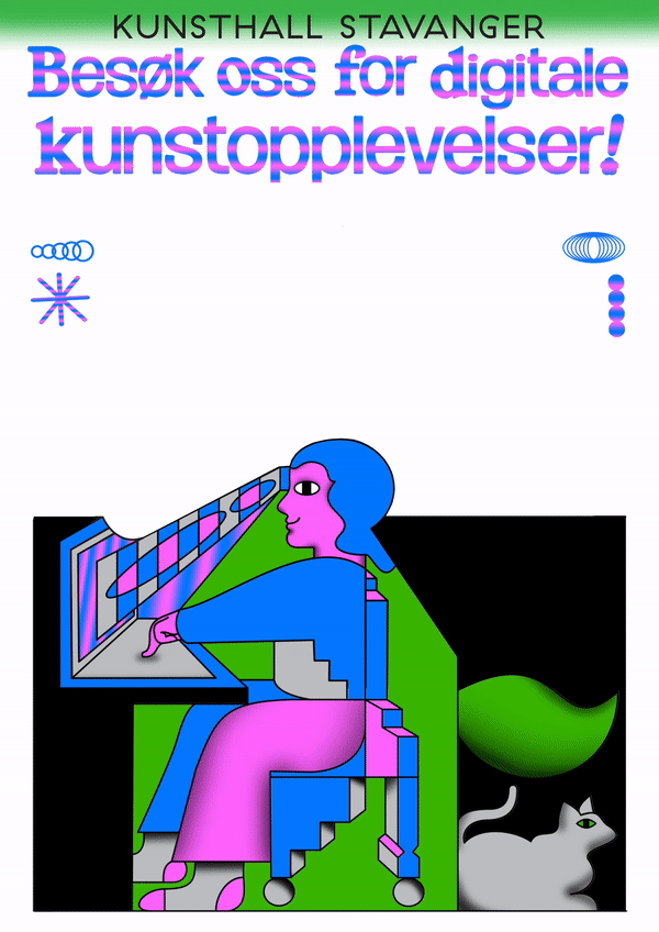
The merchandise you have designed for Butter Sessions are super playful. Can you describe the design process?
I’m pretty home sick for Melbourne at the moment and my plans to come back this summer were dashed due to covid, so when I got asked to design these pieces for Butter Sessions I think I honed into that bright, blooming, Melbourne summer feeling. The t-shirt design was made using a warped checker-grid, I liked the idea of the flower appearing from this framework and not being a soft, delicate thing but sturdy and geometric. It reminded me of those stickel-brick toys I had as a kid. I wanted to give an overall feeling of every element being kind of stickel-bricked together, the elements on the shirt are stacked on top of eachother and interlocked.
Heading photo by Lucy Dyson
Molly Dyson’s illustration and design work arranges dreamlike visions of the future, informed by hazy recollections of the past. The artist experiments with bold typography, bright palettes and surreal graphics. She reveals “I like to play with depth and overlap and make the eye work to figure out what’s going on.” Her work is often used to market upcoming music events, recognisable to punters in Naarm (Melbourne) and across Europe. What perhaps is most striking about Molly’s body of work is how seamlessly her design voice channels the varied sounds her posters represent. Her retro nostalgia aesthetic is consistent yet she's always in tune with the gig.
Molly grew up in the Western suburbs of Naarm before making the move to Berlin in 2012, taking her first design commission the same year. Since then, she has accepted poster art commissions for Neu, Kaputt in Cologne and Sameheads in Berlin. Speaking about the role music plays in her life, she informs me, “my dad and siblings are musicians so music has always been a big part of my life. I’ve played in a few bands but I much prefer being on the side of making posters and album artwork for friends rather than being on the stage! My first ongoing design job was making posters for friends in Cologne who were putting on shows and I think that helped me develop a style that fit with designing for musicians.”
Recently, Molly was asked to produce a line of Butter Sessions merchandise; Inflorescence. She chats to me in between moving apartments in the middle of a Berlin lockdown.
Can you tell me a bit about what led you to become a graphic designer?
I originally studied fine arts at the VCA in Melbourne but I never really felt comfortable as an ‘artist’, the work I made at VCA was critiqued by some professors as being too illustrative, which I thought was a bad thing! (but to be fair what I was making wasn’t very good). After graduating I realised being an illustrator was a possible career and the things i’d always been interested in; children's book illustration, posters, type and packaging design started to make sense. I moved to Berlin and attempted being a freelance illustrator but I didn’t really know how to use Adobe programs or anything like that. I worked a lot of odd jobs, taught myself Photoshop and Illustrator, learnt German and ended up studying Visual Communication at Weißensee Kunsthochschule in Berlin. It’s a small university in the east of Berlin that was one of the main design and art schools of the former GDR. I had intended to study illustration there but coincidentally the first 2 years of my degree the visual communication department had no illustration professor. I did alot of type, editorial and exhibition design projects there particularly with Prof. Wim Westerveld, the typography professor. He really encouraged me to develop my type and poster design skills which was a happy accident because I think combining illustration and type design allowed me to find a niche where I can create work for a range of contexts.
What do you find is currently influencing you visually? Where do you look for inspiration?
I am a bit addicted to instagram and always feel so excited and inspired by what people share on there, particularly seeing what friends are making like James Vinciguerra, Maren Karlson, Lasse Wandschneider, Bea Kittelmann, Ruby Hoppen, Marijn Degenaar, Adrienne Kammerer, Jack Taylor. I also often come back to the work of Mitsuo Katsui, a Japanese graphic designer whose work is really focused on colour and optical illusions.
Your works seem to inhabit quite a distinctive and almost galactic, interstellar world. How did you carve out your own style?
I think it was a combination of how I used certain tools on photoshop and an interest I have in sci-fi movie posters and book covers. I’m sorry to say that I don’t really enjoy reading sci-fi much, the covers of the books always interested me more than the stories. As a kid my dad had a bunch of 70’s Asimov sci-fi books and I used to stare at the covers finding them kind of grotesque and interesting. I still do! I think the way I use photoshop lends itself to a galactic style, lots of glowing, shining shapes, contrasting colours, airbrush textures and mysterious voids.
You are an important designer in music flyers, album covers and merchandise. How do you find music intersects or directs a visual outcome for a commission of this nature?
That is so nice of you to say! I think when it comes to making posters for shows or parties I like to try and make something that might anticipate the vibe of the event somehow, to try and create a bit of a mood for what might happen at the concert. I enjoy making posters a bit more than album artwork because the poster usually only exists to promote a moment in time. Tape or record covers hang around for so long, it makes me a bit nervous to be responsible for the long-term visual association to someones’ music. I love designing t-shirts and merch because it’s like being able to design a wearable poster.
The merchandise you have designed for Butter Sessions are super playful. Can you describe the design process?
I’m pretty home sick for Melbourne at the moment and my plans to come back this summer were dashed due to covid, so when I got asked to design these pieces for Butter Sessions I think I honed into that bright, blooming, Melbourne summer feeling. The t-shirt design was made using a warped checker-grid, I liked the idea of the flower appearing from this framework and not being a soft, delicate thing but sturdy and geometric. It reminded me of those stickel-brick toys I had as a kid. I wanted to give an overall feeling of every element being kind of stickel-bricked together, the elements on the shirt are stacked on top of eachother and interlocked.
Heading photo by Lucy Dyson